The anatomy of a design prompt that actually works
Why most prompts produce generic pages, and the six parts every strong design prompt contains.
Published · Updated
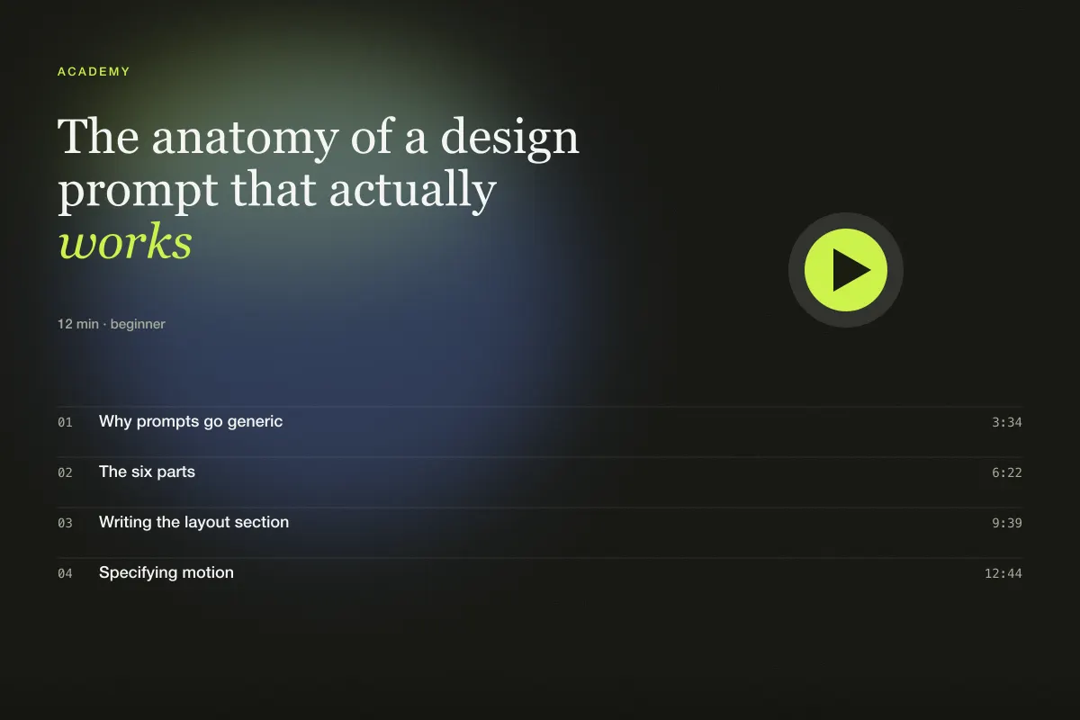
Why prompts go generic
Most people write design prompts the way they would brief a friend in a hurry: "make me a modern landing page for my analytics startup, dark mode, nice animations". The builder does exactly what it is told, which is very little, and fills every gap with the statistical average of the internet. The result is a page you have already seen a thousand times — a gradient blob, three cards, a wall of logos.
The fix is not longer prompts. It is prompts with structure. When each part of the page is described as a decision rather than a wish, the builder has something to hold onto, and the output stops drifting toward the mean.
The six parts
Every prompt in this library follows the same skeleton. You can adopt it verbatim.
- Who and what. Name the brand, the product and the audience in one sentence. "A landing page for Fathom, a privacy-first analytics tool, for indie developers who distrust bloated suites." The audience line does more work than any adjective.
- Feeling. Three adjectives, not ten. "Precise, calm, confident." If two of your adjectives could describe any website, cut them.
- Layout and sections. The page from top to bottom, each section with its purpose and its one distinctive detail. This is the longest part and the one most people skip.
- Type and colour. Actual families and actual hex values. "Inter Tight for display, 17px Inter body, background #0b0b0e, accent #d8ff3a." Vague palettes produce vague pages.
- Motion. Which elements move, how, and for how long. Include the easing curve and a reduced-motion rule.
- Constraints. Responsive behaviour, accessibility, performance, stack and what not to do.
Writing the layout section
The layout section is where the design happens. Write it as a walk down the page. For each section, say three things: what it is for, how it is arranged, and the one detail that makes it this page.
Compare:
A hero with a headline and a call to action.
with:
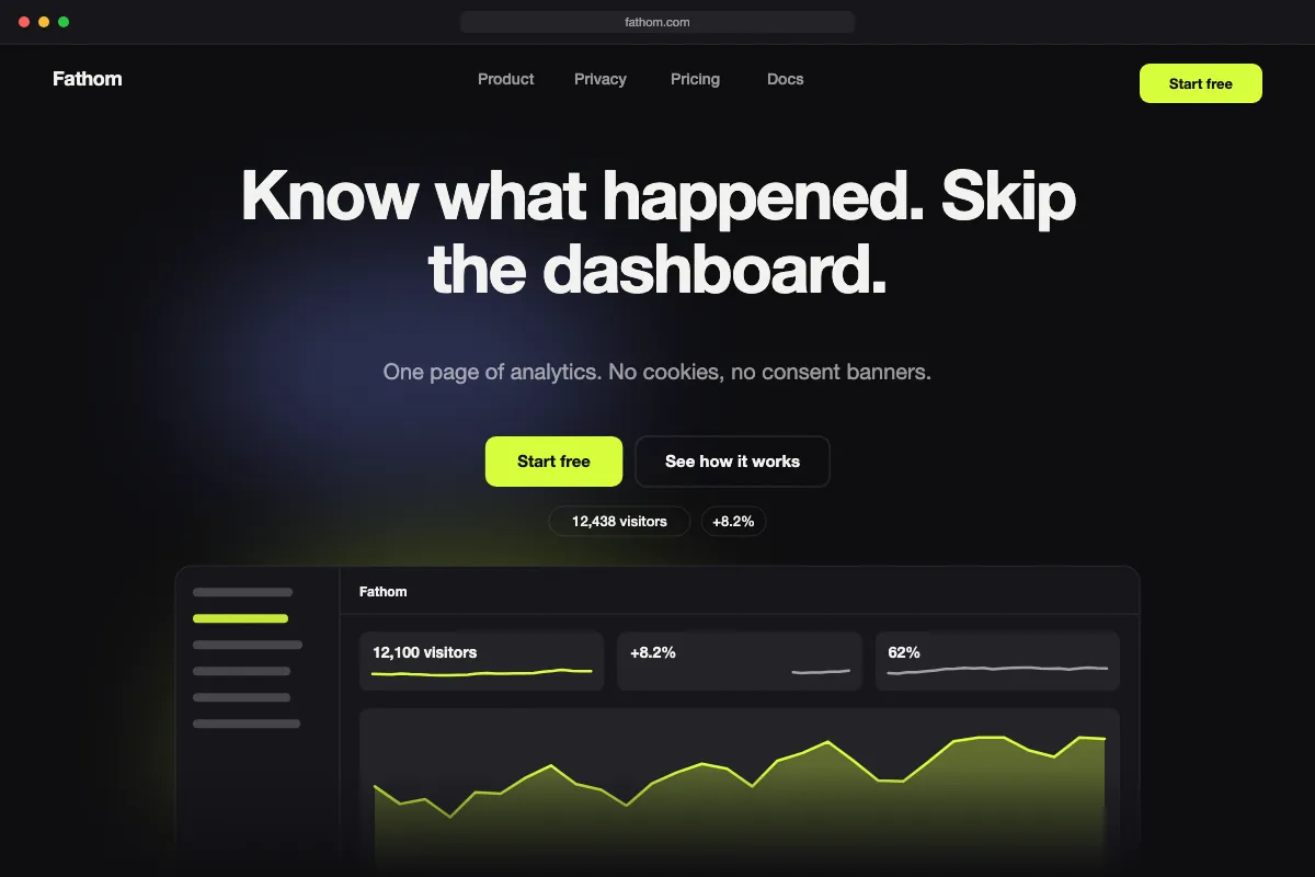
The hero opens on a single-line headline over a live-looking metric card — visitors today, a seven-day sparkline and a small green delta. The card tilts two degrees toward the cursor.
The second version is not much longer, but it contains four decisions the builder no longer has to guess: what the visual is, what data it shows, how it is composed, and how it behaves. Multiply that by six sections and you have a page that could only be yours.
A useful test: read your layout section aloud and ask whether a designer could sketch the page from it alone. If they would have to ask questions, answer them in the prompt.
Specifying motion
Motion is where AI builders most often overshoot. Left alone they will animate everything, at different speeds, with different curves. Take that decision away from them.
State one easing curve for the whole site and a small range of durations. Our default is cubic-bezier(0.22, 1, 0.36, 1) with 400–700ms for reveals and 150–250ms for interface feedback. Then list the specific animations: "chart lines draw with stroke-dashoffset when their band is 40% visible; the hero metric counts up from zero over 1.2 seconds; nothing loops except the status dot."
Always add the reduced-motion clause. It is one sentence and it is the difference between a page that respects people and one that does not.
A worked example
Below this lesson you will find the full prompt for the Fathom landing page, which is free to copy. Read it against the six parts and notice how little of it is adjectives. Most of it is nouns and numbers: sections, sizes, colours, durations.
When you adapt it, keep the skeleton and change the decisions. Swap the audience, rewrite the sections for your product, pick your own palette. The structure is what makes the builder reliable; the decisions are what make the page yours.
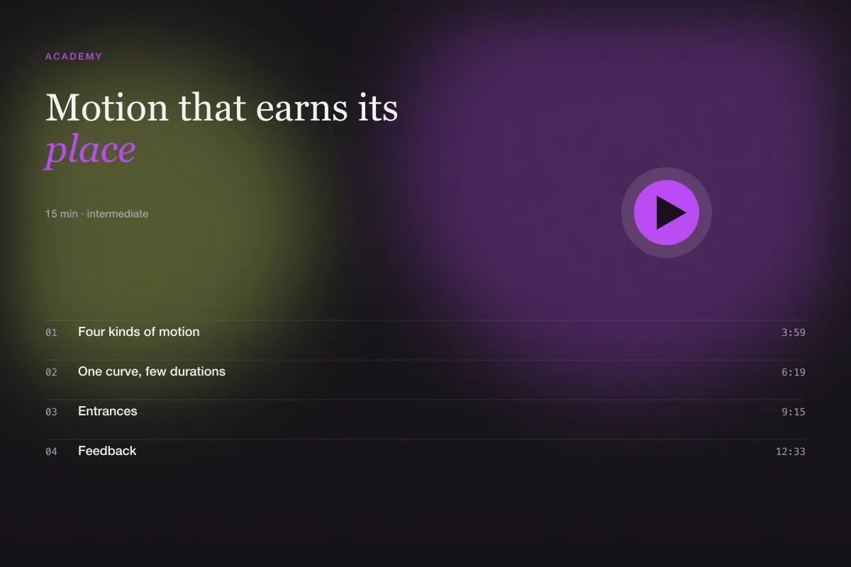
In the next lesson we look at motion in detail — what earns its place on a page, what merely draws attention to itself, and how to describe the difference so your builder gets it right the first time.